From the Vault: Web form labels - more interesting than you think
Every web form has a few components; labels, input fields, and actions. We use the labels to ask questions of our users, the input fields to give them a way to answer our questions, and actions to let them submit the answers they’ve filled in.
The alignment of your labels can have a profound effect on how people go about filling in your form. There are three types of alignment: left, right, and top.
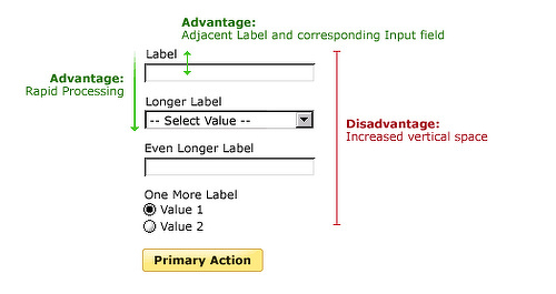
Top-aligned labels keep the labels and input fields close together. This provides three distinct advantages:
- Processing the labels and input fields requires little cognitive effort because they’re so close together (average of 50ms to move from label to input, vs. 500ms for left-aligned labels and 240ms for right-aligned)
- You can get through the form more quickly because you only have to worry about moving in one direction (down)
- There is plenty of room for the labels to expand horizontally (so you can fit longer ones on the page)
The disadvantage is that they require a lot of vertical space.
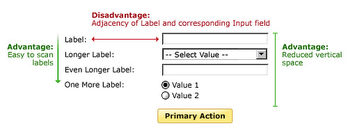
Right-aligned labels have reduced readability compared to left or top-aligned labels due to the ragged left edge they create (because we read from left to right, we prefer hard lines on the left side). They also suffer from issues with flexibility; you’ll often see right-aligned labels taking up two vertical lines of space which makes them harder to read. However, they have the benefit of taking up less vertical space and keep the label adjacent to the input field (cuts down on processing time).
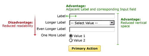
Left-aligned labels make it very easy to scan through the entire list of labels in a form, useful when users have to fill in potentially unknown information. They also take up less vertical space. However, the variable length of the gap between the label and the input field requires a lot of cognitive processing power and will slow down users.
The type of alignment you use depends on the situation; there’s a place for everything!
Images from Luke Wroblewski’s excellent book, Web Form Design: Filling In the Blanks